


Table of contents:
Introduction
As one of the most recognizable brands in the world, Starbucks has grown from a single coffee shop in Seattle to a global empire. But what has gone into making Starbucks the success it is today?
The Siren on Your Starbucks Cup Was Born in 7th-Century Italy. Coffee is one of the most popular drinks in the world and a universal mood uplifter known for its many health benefits including weight management and enhanced athletic performance. Not to brag but it helps many people across the world get through the Monday blues. And when we talk about coffee, Starbucks- one of the world’s finest coffees, definitely comes to all coffee lovers’ minds.
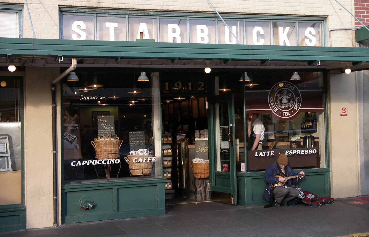
For a staggering population globally, each morning begins with a cup of steaming brew from the world’s most popular coffee shop—Starbucks. Starbucks – a global coffee giant that started as a local coffee bean retailer is now the world’s biggest boutique coffeehouse. Headquartered in Seattle, Washington, the company comprises more than 32 thousand stores in 80 countries.
When Starbucks was founded in 1971, in Seattle by Jerry Baldwin, Zev Siegl, and Gorden Bowker, three college students, they came up with the idea of selling roasted coffee beans to people. But little did they know that their business would grow to become the world’s largest boutique coffee shop in the world. Starbucks had over 27,000 retail locations worldwide by 2018 and was selling about 4 million cups of coffee per day.

Key Statistics:
- Starbucks’ net revenue reached 24.61 billion U.S. dollars in 2021
- A typical customer of Starbucks visits its store six times per month. But 20 % of customers visit the store 16 times in a month
- Starbucks offers more than 87,000 possible drink combinations
- In 2021, Starbucks spent $305.1 million on advertising
From humble beginnings, the company has grown to become the world’s leading brewed coffee brand. The Starbucks logo meaning has long been ingrained in the minds of consumers globally. The logo has been an important part of the brand’s growth since its inception. The company’s modern simple mermaid logo, despite the changes that it went through, still stands as one of the most iconic and memorable logo designs seen in history.
Read about all the factors below that drove the Starbucks logo to become one of the most successful company logos there are today.

The Starbucks Logo History & Origin
Where did the Starbucks logo come from? Pequod was the name given to Starbucks when it first opened its doors in 1971. This name was inspired by the American classic tale of Moby Dick and was later changed to Starbucks, a name that was derived from Pequod’s chief mate, Starbucks.
Starbucks logo history is inspired by the famous twin-tailed siren in Greek mythology. It was thought that sirens were creatures that enticed sailors to attack and devour them off the coast of an island in the South Pacific, according to the mythical stories. As a result, the siren represented Starbucks’ desire to attract coffee lovers to its store.
Since its inception, the first Starbucks logo has undergone numerous revisions, the most notable of which was in 1987. Starbucks’ new CEO, Howard Schultz, was appointed that year, and the company has since revolutionized itself to become a company solely focused on making the best espresso drinks.
Evolution of the Starbucks Logo
It wasn’t long after the first Starbucks in Seattle opened its doors that the founders realized they’d need a good logo. Terry Heckler scoured through old marine books until he came across a 16th century Norse woodcut of a two-tailed siren, hoping to capture the seafaring history of coffee as well as Seattle’s close connection to the sea. This was the image that they used to create the first version of the Starbucks logo. What is Starbucks logo supposed to be now? The logo has evolved with the company over the years, but the basic elements have remained the same, with the two-tailed siren.
- The Starbucks Logo from 1971 to 1987
The Starbucks logo debuted in 1971 and remained the company’s brand identity for the next fifteen years. The main image of the logo was originally a topless mermaid or siren with a double fishtail and a visible navel. This was accompanied by a coffee-brown circular ring around the figure. “Starbucks Coffee, Tea, and Spice” was written inside this circle.
There were numerous small accents, giving it an ornate and traditional appearance. The text was also written in block letters in a modern sans-serif typeface. The ornate look of the mermaid inside the circle was balanced by this typeface.

- The Starbucks Logo from 1987 to 1992
In 1984, Howard Schultz wanted to make the logo crisp and simple. The color scheme of green, black, and white was introduced in this version to represent Starbucks’ growth, freshness, and prosperity. The green and white colors had a much more soothing effect on the brand’s customers than the old coffee-brown color scheme.
In contrast to the original design, the siren’s entire body was no longer visible. The figure grew larger, and its hair seemed to cover the majority of its body. In addition, the text had been changed to ‘Starbucks Coffee’ to reflect the company’s focus on coffee. The brand’s name was written inside the circular ring, with two stars on each side.
The Starbucks logo evolved into a clean design with a close-up view of the mermaid in the third version. Only the fishtail remained visible after the navel had vanished from the design. The logo was designed in a green and white color scheme with the company name written inside a circle with two stars on each side.

- The Starbucks Logo from 1992 to 2011
The third version of the Starbucks logo features an even closer look at the siren. Its torso has vanished completely from view, but its twin tail remained visible. The typeface was another thing that changed in the design. The typeface used in the redesigned Starbucks logo was slightly modernized, with the letters being wider and larger.
However, this Starbucks ring logo design became a problem for the company because it was thought to be too easily replicable. Other countries copied and used the same logo design for their knock-off versions of Starbucks, making it difficult for some customers to distinguish between the fake and real logos.
- The Starbucks Logo from 2011 to Today
The Starbucks logo was redesigned in 2011 as the company was celebrating its 40th anniversary. Now the logo was a brighter and simpler version of the previous one. This time, the siren’s hair and the two mermaid tails were in the green Starbucks background, and she was all white.
After the words “Starbucks”, “Coffee” and two stars were removed from the logo, it appeared to be more simple. This was because Starbucks began to sell items other than coffee drinks. They wanted to grow their business even more by expanding their product offerings to their customers.
The designers drastically altered the appearance of the siren’s nose, eyes, and hair. Repositioning her face was one of the major changes they made. The design was more radicalized as a result of it. In the new Starbucks logo, the Siren’s flowing locks appear to be much wider. Her face grew much larger and more prominent, and it was asymmetrically positioned.
The mermaid’s face, on the other hand, had a slight right shading to avoid looking like a mask. The siren’s face was made asymmetrical for a variety of reasons, one of which was to make her appear approachable and realistic. This textless Starbucks logo is still in use ten years after the redesign. The Starbucks logo 2022 is a much simpler symbol that everyone can recognize.
The Starbucks Logo Design Elements
The iconic Starbucks logo is one of the most recognizable symbols in the world, and it has won various prestigious design awards for its futuristic design and intricate details. The logo recently underwent a significant change to celebrate the 40th anniversary of the coffee giant in 2011 by Starbucks’ in-house design team and Lippincott.
1. Shape
Starbucks’ logo has always been circular, which is one of the most common graphic design shapes. Because the circle has no beginning or endpoint, it could be interpreted as a symbol of Starbucks’ ongoing movement or legacy in the coffee industry. The text was inside the circle and two stars were outside the circle in the circular version of the Starbucks logo from 1987. These elements are no longer included in the logo.
2. Color
Starbucks’ logo is made up of deep green and white colors. The background color is green while white is being used for the main siren symbol. The green color is associated with healing, nature, and protection in the design world. It’s also a color that represents wealth and money.
The colors used in the Starbucks logo were chosen to reflect how the company wants to be perceived by its customers. The green color was chosen by the designers to represent the brand’s positive attitude toward its customers and partners. Starbucks wants to be seen as a company with great corporate social responsibility. The brand sources its coffee beans ethically to ensure that the farmers they work with are treated with care.
3. Font
Except for the most recent version, Starbucks’ logo design has always been based on a simple but bold font. The brand’s name is spelled out cleanly and sharply using a sans-serif font and block letters.
The new logo, however, did not require the text to be part of the logo because Starbucks’ logo is easily recognized by consumers globally. Customers will be able to tell that this logo belongs to Starbucks even if it does not have a name.
4. Icon
Starbucks’ logo features a twin-tailed siren, which is a reference to Seattle and the sea. The siren is seen with hair that resembles ocean waves, to convey Seattle’s proximity to the sea. The designers wanted to keep the mythical and mysterious appeal of the siren. The siren, on the other hand, is thought to represent obsession, addiction, and entrapment.
Also, the designers chose to emphasize the siren icon’s femininity and softness as a result of their presumed dangerous characteristics. Lippincott wanted to make the siren more human in his latest design. Because symmetry was thought to be a defining rule of human beauty, the designer decided to add asymmetry instead. The siren’s nose was dipped more to the right side of her face to achieve this.
Many fans praised the siren’s face after a simple shadow adjustment was made. The asymmetry was retained because the designers believed that, at the end of the day, people are not drawn to human perfection.
The Starbucks logo is one of the most recognizable symbols in the world. The iconic green and white logo has become synonymous with the brand, and its design is an example of how powerful a logo can be in establishing a brand. The logo’s minimalist design and use of a single color help to create an image that is easily recognizable and memorable.
In addition to its logo, Starbucks has used other branding strategies to establish itself as a global brand. The company has created an emotional connection with customers by using its stores as a place to relax and unwind. This is achieved through the use of comfortable seating, inviting music, and a cozy atmosphere. Furthermore, Starbucks has used clever marketing campaigns to reach its customers. From its use of social media to its memorable advertisements, the company has created an effective strategy that has helped to build its brand.
Another key factor in Starbucks’ success is its commitment to sustainability. The company has made a commitment to reducing its environmental impact and has implemented a number of initiatives to do so. From reusing materials to using renewable energy sources, Starbucks has made its commitment to sustainability clear.
Overall, the Starbucks brand has achieved its success through a combination of effective branding strategies. From its logo to its commitment to sustainability, the company has used a variety of tactics to create a powerful and recognizable brand. As Starbucks continues to grow, its iconic brand will likely remain a fixture in the global marketplace.

Conclusion – Popularity of the Starbucks Logo
The Starbucks logo has a one-of-a-kind simple design. It now only has the siren’s face, her thick flowing locks, and a hint of two mermaid tails. Being one of the most recognizable logos globally, Starbucks established itself in the market and has made a statement with its brand and logo over the years. Starbucks has always had a distinct visual identity that stood out from its competitors. It has always stayed true to its brand values, which has contributed to the global success of the coffee brand.
On top of that, the Starbucks logo quickly became a symbol of status. The positive associations and appearances in pop culture demonstrate the power of a good logo, especially when combined with a strong marketing strategy. The Starbucks logo has a long and illustrious history, serving as a great model for new businesses to follow when designing their logos.
If you have any questions about the menu for Starbucks coffee, Starbucks coffee size, Starbucks coffee shop near me, Starbucks coffee options, Starbucks best coffee, Starbucks hot coffee, Starbucks best cold coffee, Starbucks sugar cookie syrup, etc., you can visit their website here for more information.
PROS is a digital marketing agency that provides e-commerce solutions ranging from Web design & development to Shopify development.
Contact us today.
Deepak Wadhwani has over 20 years experience in software/wireless technologies. He has worked with Fortune 500 companies including Intuit, ESRI, Qualcomm, Sprint, Verizon, Vodafone, Nortel, Microsoft and Oracle in over 60 countries. Deepak has worked on Internet marketing projects in San Diego, Los Angeles, Orange Country, Denver, Nashville, Kansas City, New York, San Francisco and Huntsville. Deepak has been a founder of technology Startups for one of the first Cityguides, yellow pages online and web based enterprise solutions. He is an internet marketing and technology expert & co-founder for a San Diego Internet marketing company.
